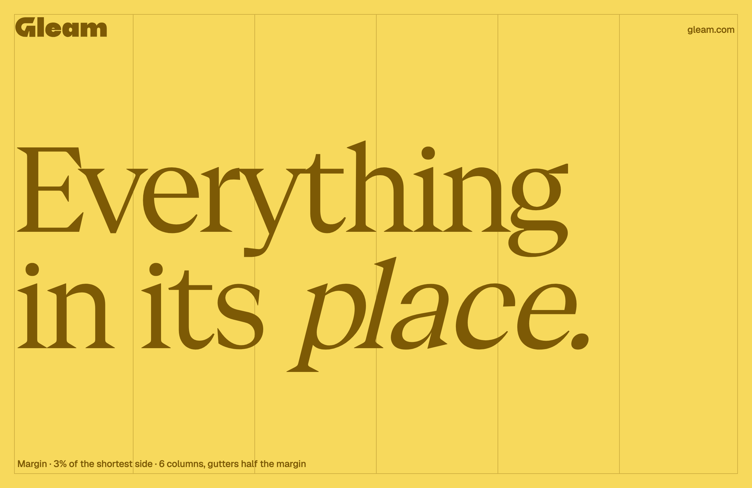
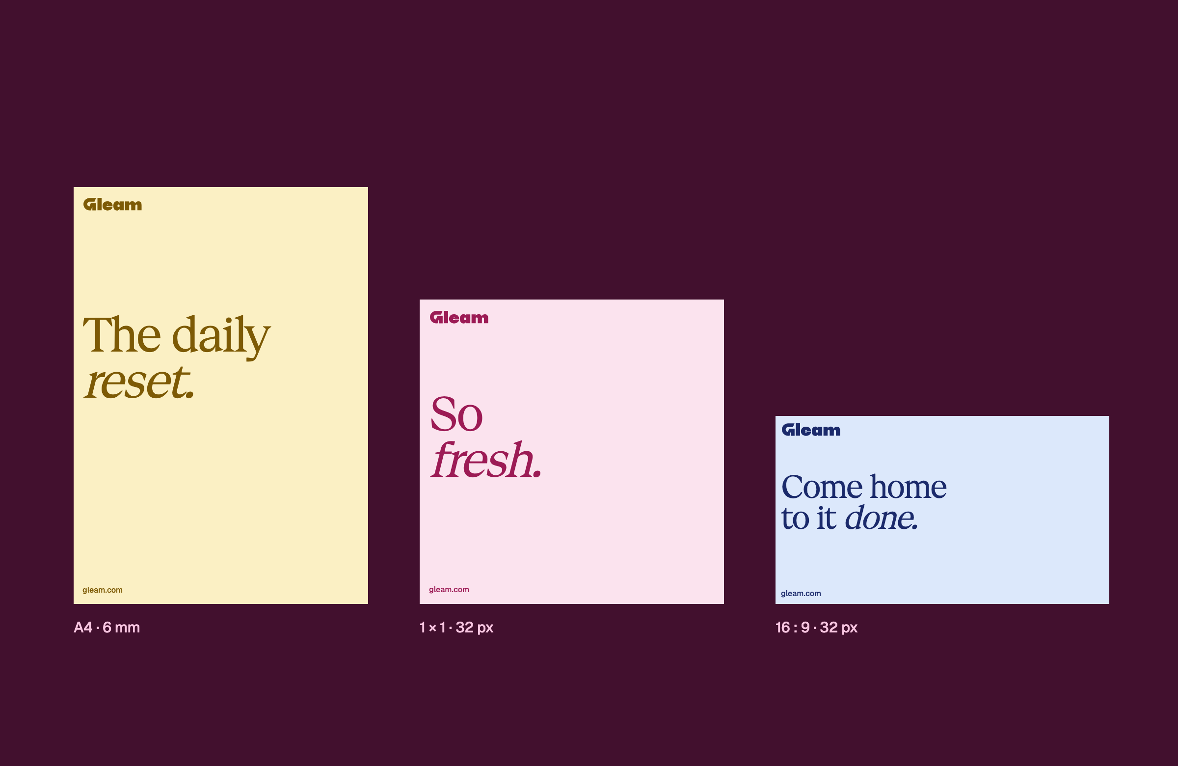
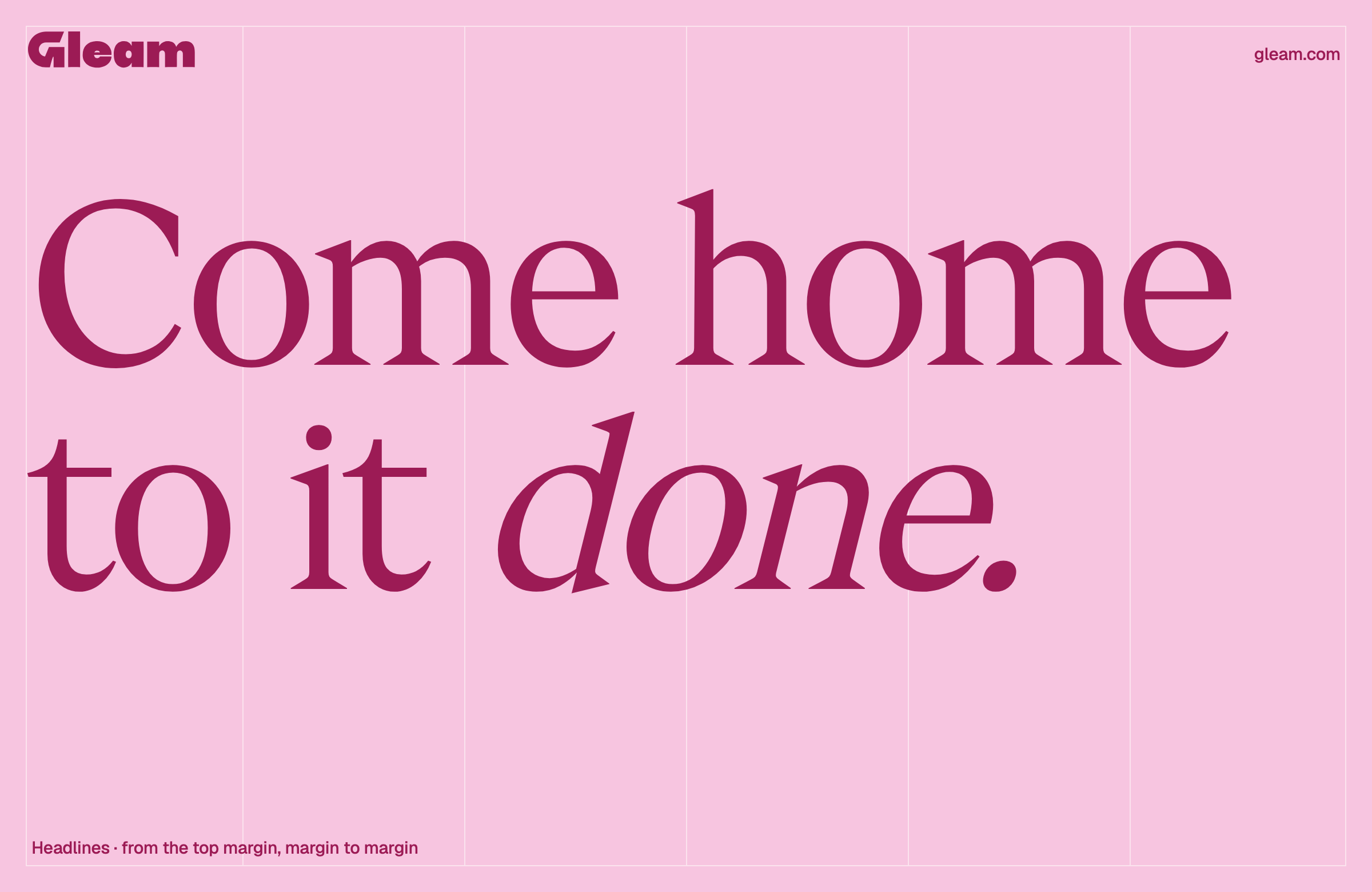
Our grid runs tight to the edges: a 3% margin, six columns, one subject per frame. Labels sit in the corners on the same inset everywhere, display type goes as big as the format allows, and nothing floats.
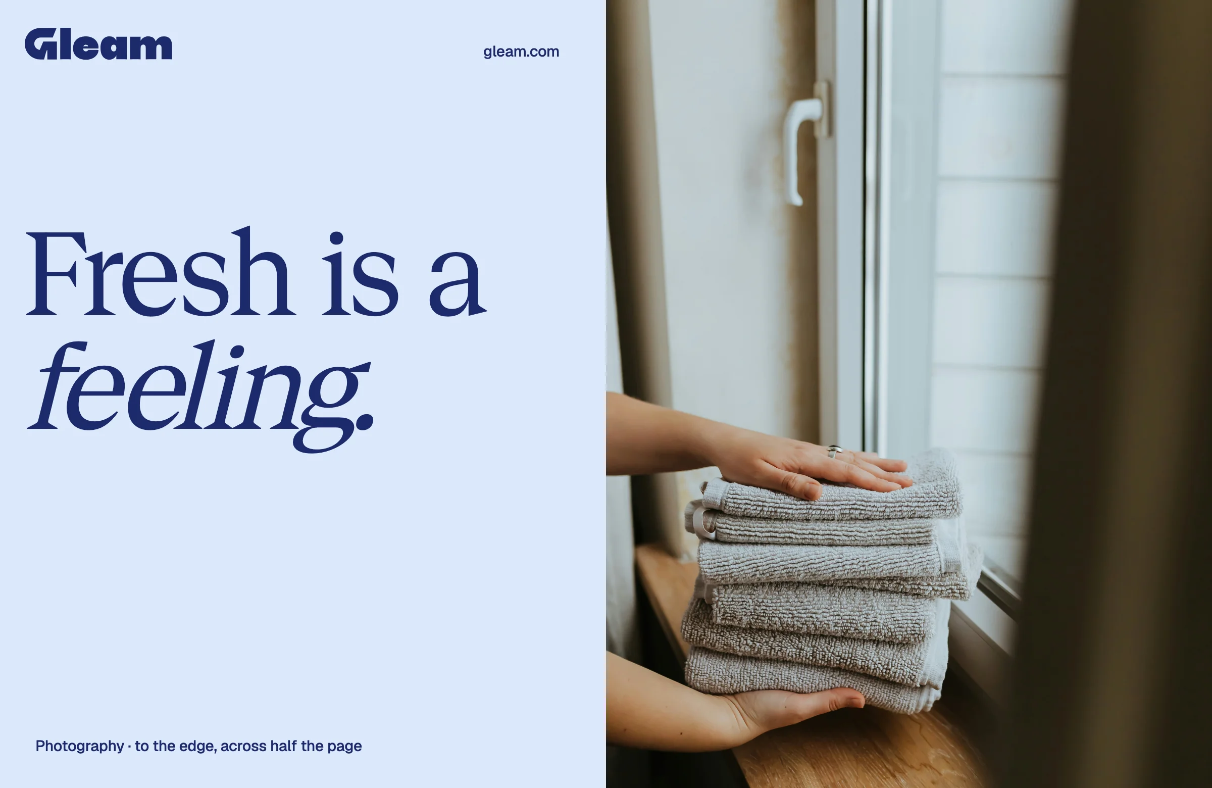
One grid for every format. Swipe through to see how the logo, headlines and photographs sit on it.

The rules that keep every Gleam layout tight. They apply to every surface, from a story to a billboard.
Scale the headline and the image until the gap between them closes.
Leave dead space in the middle, or float things with air on every side.
One axis per surface: the image sits on the same margin line as the type.
Center an image against left-set text.
Two type sizes only: giant display or a small label in a corner.
Add in-between sizes that compete with the headline.