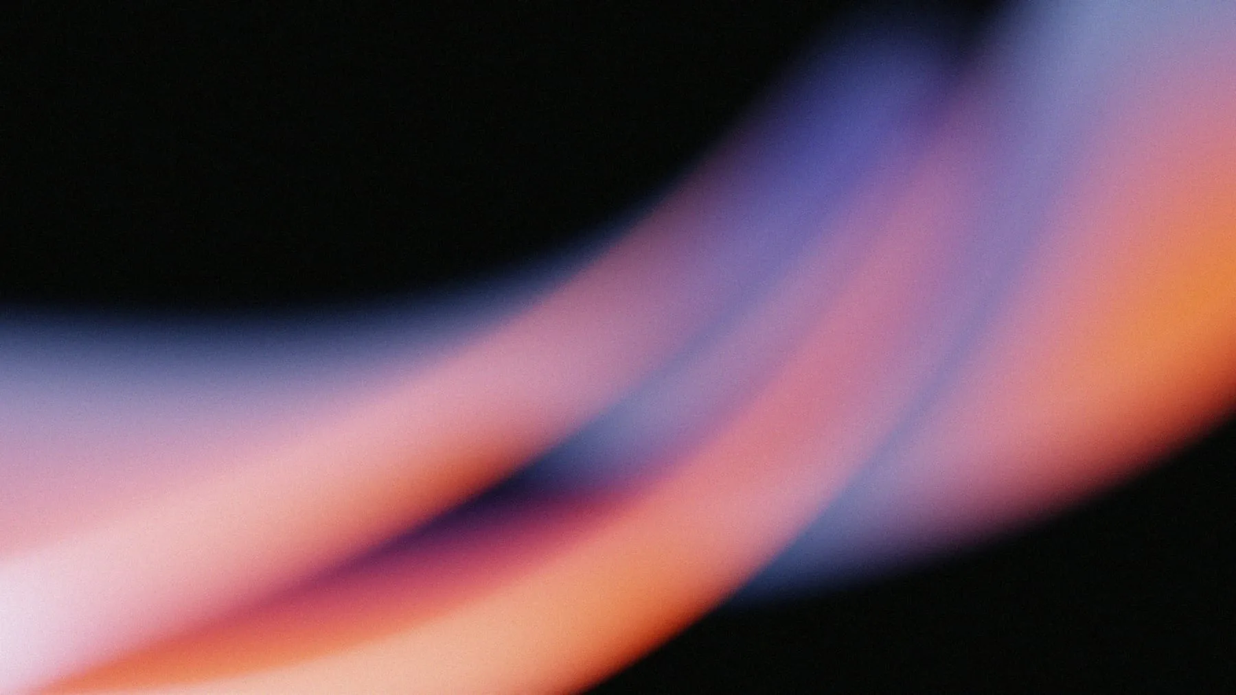
Photography
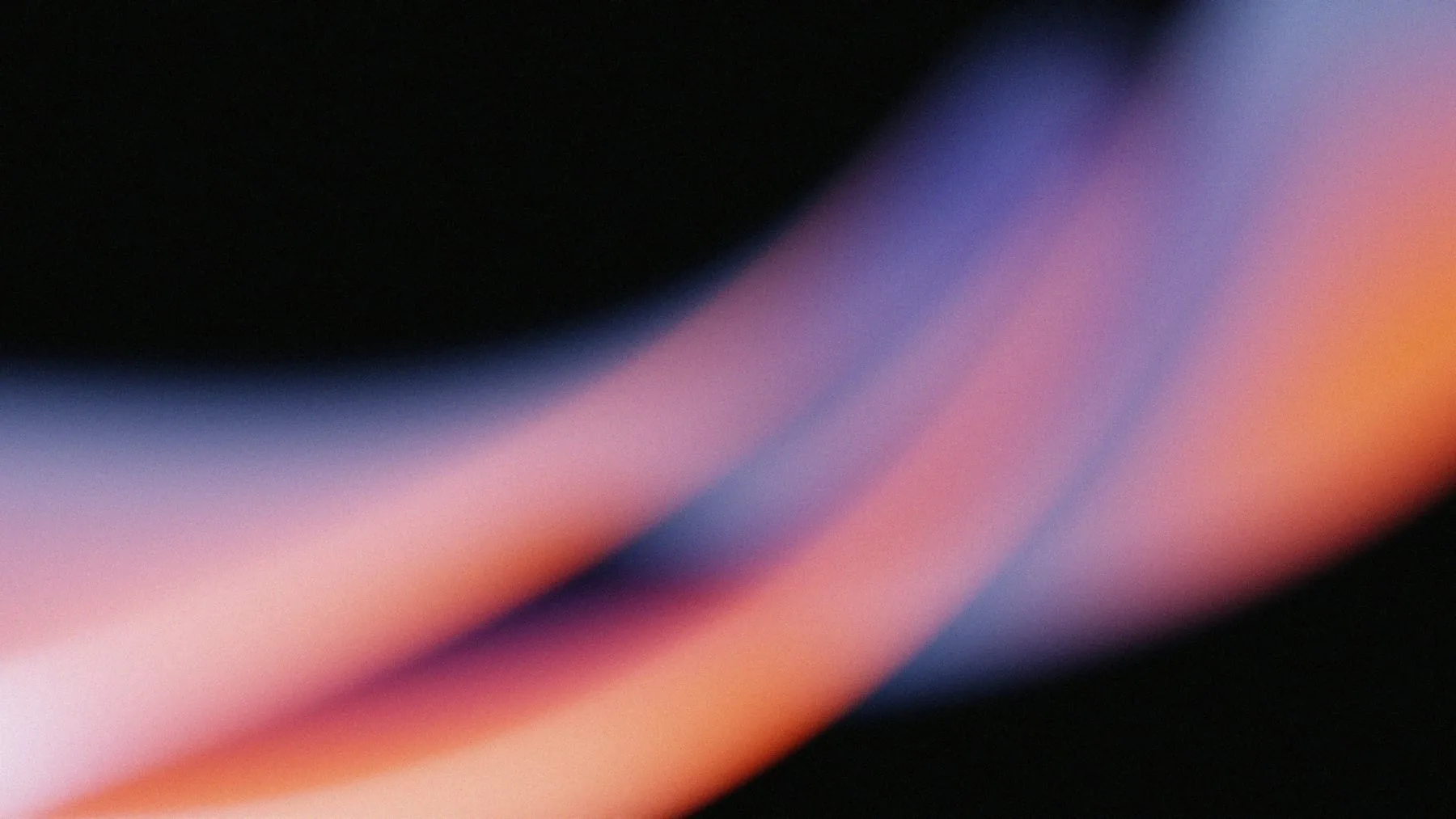
Halide's imagery is light itself: long exposures of colored light on black, blurred and grainy, like something caught through a crystal. When people appear they are glimpsed, not posed, moving through the frame or at work with the camera barely noticed.
Three checks before a picture goes out.
Textures are streaks, waves and swirls of light on a black ground. Nothing illustrated, nothing geometric.
People are caught in motion or mid-thought, often blurred. Never a group looking at the camera.
Fine film grain on everything, so the light feels photographed rather than rendered.
The set that sets the tone. New pictures should sit beside these without a seam.
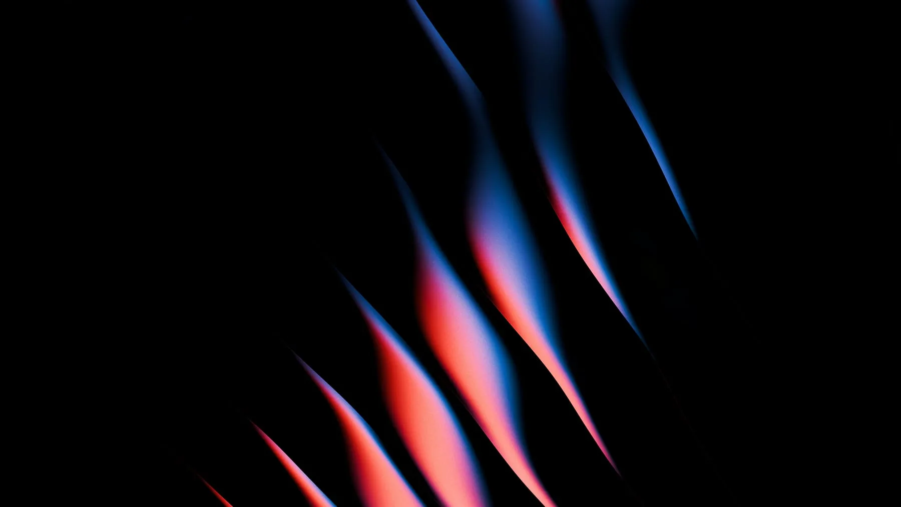
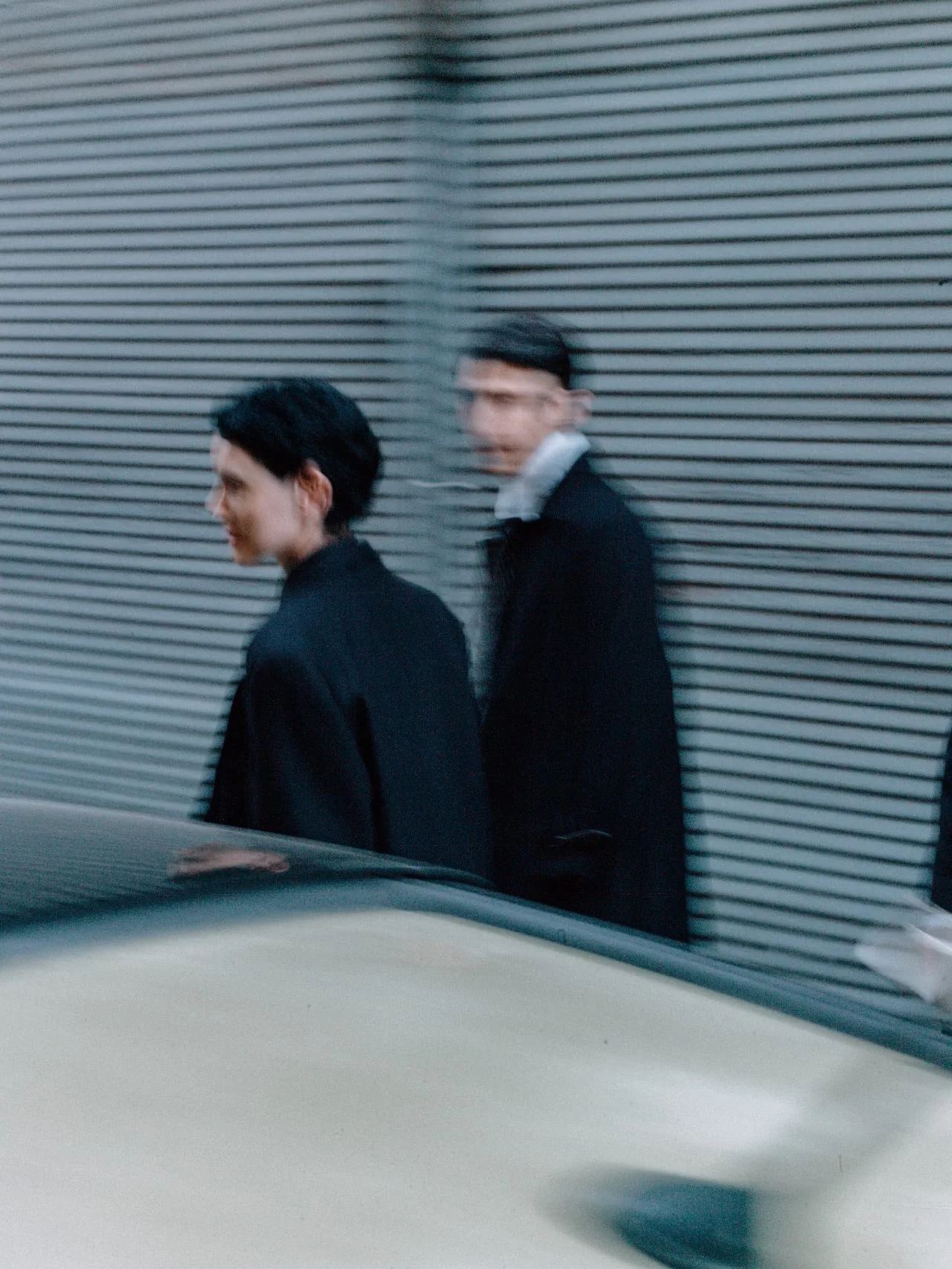
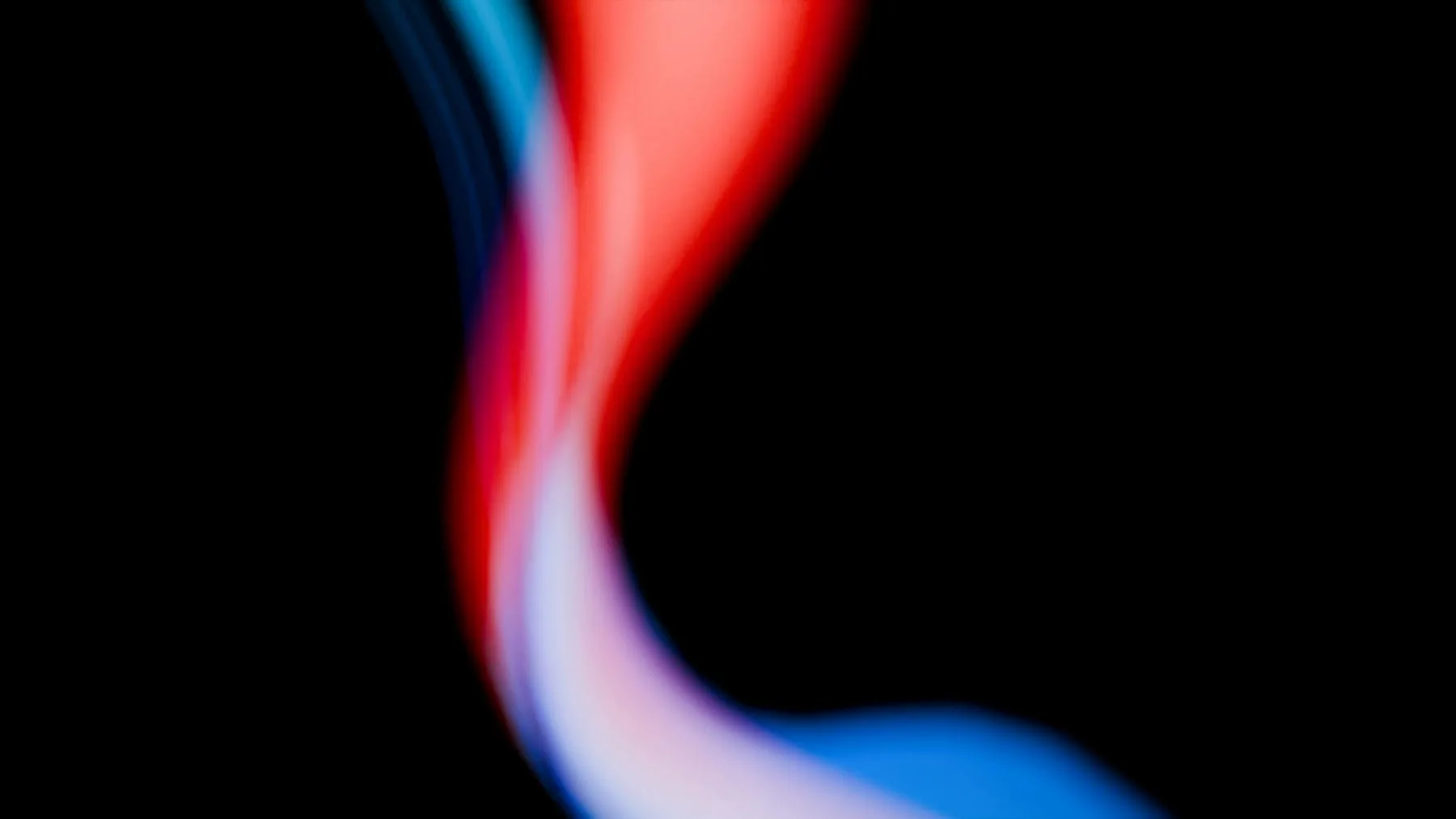


How a picture is shot and finished, so every shoot looks like one.
The calls that come up most when choosing or editing a picture.
Use the light photographs as backgrounds behind type.
Draw a gradient in software to stand in for one.
Catch someone passing, working, half turned away.
Pose anyone, or show a face in sharp focus.
Keep blacks black and the grain in.
Lift the shadows, add glow or sharpen.
Set type on the black, beside the light.
Set type across the brightest streak.